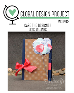
Welcome to the Global Design Project #GDP068 Today we are CASING (Copy and Selectively Editing the incredible Jess Williams!!
Thank you to all that played along with us last week for the 'trees' challenge. Make sure you go and check out all our other winners and special mentions from last week Click here to see them!
Here is the inspiration we have from Jess Williams -
To give you some inspiration - Here is what the design team came up with for this theme. Feel free to click on their name or picture to visit their blog and be inspired by their work. The Design Team love hearing from you - so if you have a chance to leave a comment please do!
Global Design Project Design Team
Guidelines:
- Your creation must be NEW and reflect our project inspiration parameters
- LINK your entry DIRECTLY to the blog post or other gallery
- Please MENTION Global Design Project in your blog post and link back to us.
- When sharing publicly please use our hashtag #GDP068
- We reserve the right to remove any links that do not comply with our guidelines.
- Deadline for entries closes on Monday 9th January 2017 3:00pm AEDT. To view some of our time/dates in your region please see our Schedule.
Have fun and thanks so much for playing along!
The GDP Team xo
Add your projects here:
Add your projects here:


Love Connie's card! (I couldn't get the link to work to her blog though)
ReplyDeleteIt's working now Heather - thanks for letting us know!
DeleteLink to Connie's card isn't working. Some lovely cards.
ReplyDeleteIt's working now - Thanks Debra.
DeleteConnie's blog is working now. I love all these cards with their different takes on the challenge. Lots of inspiration here.
ReplyDeleteThanks HJ!
DeleteHappy New Year to everybody! I notice that several designers maybe using a thick brown card stock such as Kraft 12" X 12" (30.5 X 30.5 Cm) Cardstock. The shades appear quite different among the cards (Kylie, Shaun, Steffi, Brian,). Maybe it just the lighting in your presentation of the cards or does the brown color truly vary? Even the sample on the SU page is much lighter than any of yours.
ReplyDeletehttps://www.stampinup.com/ecweb/productdetails.aspx?productid=133674
Just curious. :)
Brian and I used Kraft Brent - like Jessica's card. Shawn and Steffi used a variation - Crumb Cake. Hope that helps!
DeleteHi Brent - Happy New Year to you too!
DeleteStampin' Up! Have few shades of light brown that are indeed similar and also you are right is saying it can also change the look by how we take our photos and different light sources.
Kraft, Crumb Cake, Sahara Sand and Tip Top Taupe that can all look a little similar, especially when photographing in different light.
I hope this helps?! Or I possibly may have confused the situation! xo
I get it. Wow, I thought the brown on Jessica's card was more of a copper color. It looks to me like Kraft is treated as a color but with no single assigned RGB. Thanks!
DeleteThere could be a variance in fuzzy texture among the brown card stock item. The fuzzy texture could cause the appearance of the brown color to vary depending on direction of light source.
ReplyDelete